Hill charts for teams. Where the work is, not how much is left.
Tip
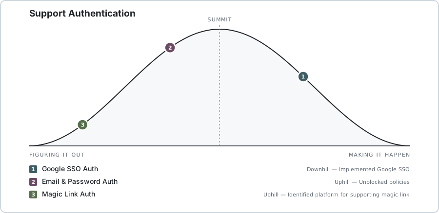
That chart is live - click it to see the full progress.
Paste one line into a README, a PR description, or a wiki page, and it redraws itself every time someone moves a dot.
"80% done" is a lie you tell twice: once when you're stuck, and again a week later when you're still stuck. A percentage can only go up, so it goes up whether or not anything was figured out.
A hill has two sides, and that's the whole point:
- Uphill - figuring it out. Unknowns, spikes, "I think it works this way." Progress here is understanding, and it isn't visible from outside.
- The summit - nothing surprising left. You can now describe the rest of the work in sentences that don't contain "probably."
- Downhill - execution. Boring, predictable, mostly typing.
Two scopes both "halfway done" are in completely different amounts of trouble if one is climbing and the other is descending. Position on the hill says which. That's the question the chart answers and the bar chart can't.
The curve is flat at both feet and flat over the summit, and that's deliberate: height reads as certainty, not as distance travelled, so a dot creeping up the steep part feels like the real work it is.
Borrowed, with thanks, from Basecamp's Shape Up.
# api - Postgres on 5432, then the server on :8080
cd api
cp .env.example .env
docker compose up -d
go run .

# web
cd web
pnpm install
pnpm dev
Details - migrations, Supabase, tests - live in api/README.md.